So I know the site's only been live for about 2 weeks but something about putting a site out into the world really has a way of bringing out all the bugs. So moving forward I'll try to do monthly updates of everything that I've changed. Feel free to follow along here for the highlights or dig in deeper at my Github clone of the site!
https://github.com/BabyMaybe/siliconunicorn
So without further ado, here are the Release Notes for the October Edition of SiliconUnicorn.com
Responsive Last Web Design
Lets start with the big one. All user facing portions of the site are now responsive! Go ahead, grab that browser window and drag it back and forth!
In my rush to go live I neglected my mobile users and for that I am sorry, but the first wave of mobile friendly edits is now live! (Future sites will of course be done Mobile First as they should be, now knowing what a pain it is to go backwards from there.)
The following pages are now mobile friendly:
- Main Page
- Individual Post Page
- Login
- Signup
The only remaining one needing attention is the Post Authoring/Editing page, which you guys can't see ;) and a little more love for the Comments Section on the Individual Post Page.
Favicon
This one is (literally) small but exciting. If you check your browser tab you will now see the following image when you go to my site!

This is harder to do than it should be, but it should work on all browsers, devices, and platforms now!
404 Page
Trying to navigate somewhere that doesn't exist on my site? Well now you will find a shiny new 404 page! Hopefully you'll never find this unintentionally, but I can rest easier knowing that it is there. Here try it out!
http://www.siliconunicorn.com/ThisPageDoesNotExist
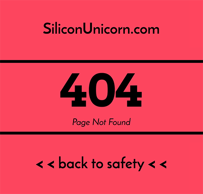
You should be greeted with this lovely yet ominous page!
New Logo
So the logo has actually gone through 2 revisions. Originally it was entirely a text based logo and looked like this.
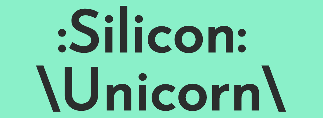
A fine logo, or so I thought. But I wanted to push it a little further. So I came up with this.
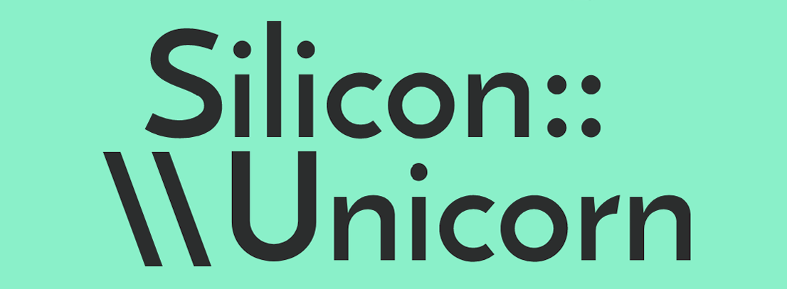
Using a slightly lighter version of the typeface (Josefin Sans) I consolidated the non Alpha characters to either side to invoke both a Silicon Chip and a Unicorn Horn, and started to play with the interaction of the letters between the words (most noticeably between the two lowercase Is and L and the U.
So I was happy with that, but wanted to push it a little further. So I sat down, hammered away in the glyph mines and came up with this which is what you are currently seeing on the home page.
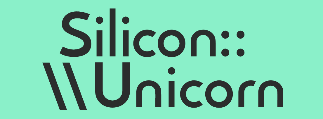
The changes are fairly subtle, but I went into the glyphs and removed all the flourishes (ascenders? terminals? GD kids help me out here!) from the letters. I used the circular portion of the O to reshape the R and N to give everything a more sleek, modern, and friendly appearance. And finally, I tweaked some of the spacing to create some more interplay between the letters, note that the O is now directly centered above the I, that the N now sits more decidedly above the C and O, and that the two colons are slightly more spaced out to suggest a more square silhouette.
I think the new design is more balanced, fluid, and clean looking, but I still have a few points I would like to play around with a little more so we'll se where we go from here.
Other Improvements
Here are some more mostly invisible but important features that got added since launch:
- There is now an Edit Post page, that only Authors will ever get to see.
- You can now return to the Home page after selecting a Tag filter by clicking on the Logo in the Hero banner
- Admin's can now browse uploaded Images in the Admin Panel
- Add Titles on Post Tab - No idea what that means, but its in my notes!
- There is now a link to the Login Page from the Signup Page incase you get stuck there by mistake
Bugs Squashed
Unicorn hooves are good for many things. One of which is squishing bugs. The following bugs have already been squashed:
- Page unreachable when www included in site name (this was a DNS configuration issue)
- AJAX Hearts were not working on comments, but now they are
- Images were oversized in Posts. They are now limited to 100% of the post size
- Default tags have extra spaces. This was due to my love of style over function and has been corrected.
- Links no longer add in Authoring View. This was due to repurposing the same modal for images and links.
Future
Theres still a lot of features I'm trying to implement in the future, as well as some bugs that are already crawling back in, and some niceties I'd like to add in. Hopefully in that time I'll also be able to actually produce some content and maybe start on a larger side project! Until then enjoy the improvements to the site you magical readers!